Irresisitble Film Graphics

Trying something different here. I thought I’d just include a smattering of graphics from the project to show the breadth of the project, rather than organizing by type of item. The Film Irresistible was great fun to work on and the script was very funny. I was very proud of my work on it and I was glad to meet Jon Stewart who was essentially the news, back when I was in college.


Photo Composites – Additional

Photo Comps can be one of the most frustrating and difficult aspects of Graphic design. They basically involve inserting an actor into a different background of some kind, except the actors photos are often artistic, low-rez or otherwise taken in not-ideal situations, and I’m tasked with making them fit into a background, often not of my choosing. Over the years I’ve come to a pretty strong understanding of how to make them look as good as possible, and I’ve included a number of them here, but sometimes it’s just luck that the lighting conditions happen to match.

Here’s a small gallery of some recent comps.


Raising Dion Renderings

Here’s a bunch of random renderings and pre-viz I did for Raising Dion. Some are more concept, some are just placement for a piece of artwork I generated.


Fictional Movie Posters

For MacGyver and Raising Dion they needed some fictional movie posters for set dec and playback so I made these. Got to play with some fun Photoshop compositing techniques.  Notably Raising Dion was a Netflix show and they allowed us to use the actual titles of real films for our posters, as long as we agreed to avoid real artwork, as their standards and practices are far less strict than network TV.


WW2 Bomb graffiti and bomb schematic

In Macgyver S4E3 we visit Germany and encounter a particularly sinister relic of WW2, one that has been causing mayhem and fear long after the war. I got to make a large-scale schematic of the detonation mechanism based on loads of research on the actual device. I also got to design a fun “goodbye Adolf” graffiti for the bomb itself, which got heavily featured and made a cool appearance in the intro for the episode! Really fun project!


Grim Reaper Lockout screen

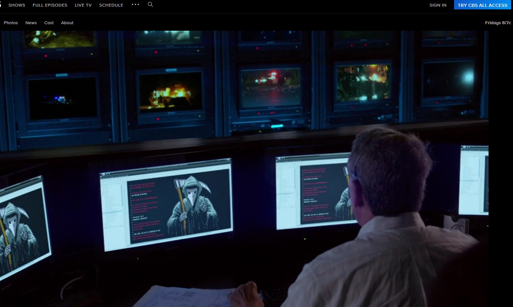
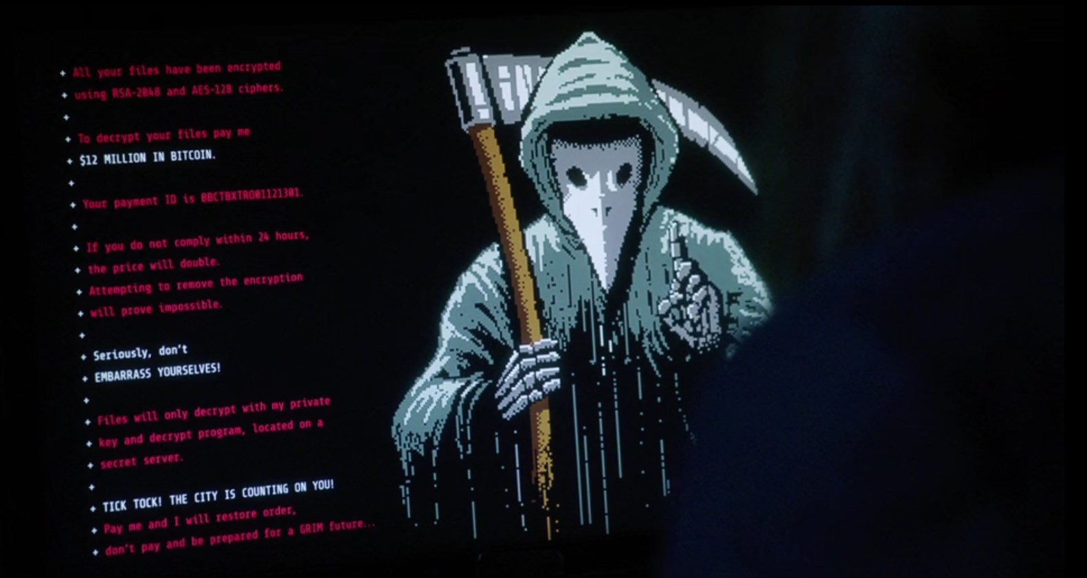
In Macgyver S04E09 a government mainframe gets infiltrated by a mysterious hacker who’s only calling card is a sinister grim reaper figure wagging its finger. They wanted the artwork to look like an old NES game so I looked up the classic NES color palette and used that for the animation. I also was careful to use the NES’ real screen resolution to lend a little extra authenticity


Here’s the final version with the animation. Note each frame of the hand wagging actually had to be custom made to as the resolution was too low to simply rotate the hand in photoshop.

Here’s an early version where it was a skull, which they later changed to a plague mask to make it more interesting and unique:


Here’s how it appeared in the episode. Spooky!


Artemis Jayne Product Box

The producers wanted something that recalled the Drew Struzen-esque movie posters from the eighties, especially those inspired by Riply from the film Alien. I had to create a fictional strong female character for an imaginary film. unfortuantely we only had a day to finalize the artwork, so there was a bit of a scramble, but the end result turned out great and was highly featured!


MacGyver Products and Props

As one might imagine, Macgyver, Season 4 was absolutely loaded with fictional products that needed custom skins. Here’s a selection of some of them.


Blue Post Neon BBQ Sign

Some outdoor signage I designed for our Blue Post BBQ location in Tammy. Melissa McCarthy ended up keeping the Neon sign, because it looked pretty nifty.


Newspapers – various

Over the years I’ve done loads of news papers and inserts for various shows. As we move into the modern world, newspapers have become less and less frequent, but for vintage or period pieces, newspapers are ubiquitous.